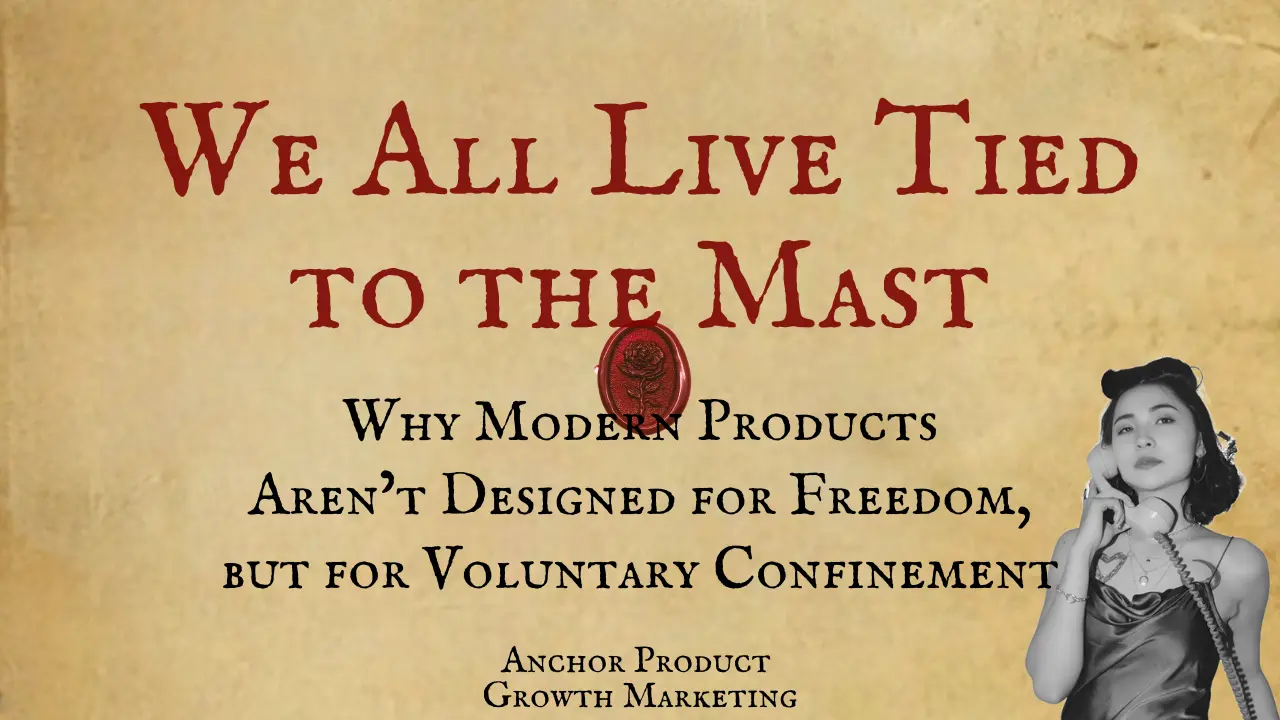
The Engagement Illusion: How Design Hooks You on Nothing
How Phantom Metrics, Platform Echoes, and Sisyphean Loops Have Hijacked Our Interfaces
the-engagement-illusion-how-design-hooks-you-on-nothing
Behavioral Design
SaaS Growth and Retention
The Cult of Progress — Designing for the Illusion of Growth
The User in the Loop
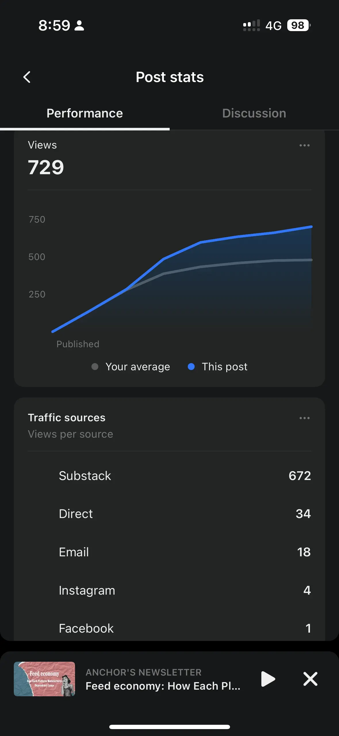
You open Substack and check the view count on your latest article. It’s gone up by one or two since yesterday. Sometimes you’re pretty sure those views are just you refreshing the page or accidental clicks.
You start wondering if anyone’s actually reading your stuff, or if these numbers are just there to keep you hanging on.
Then you log into LinkedIn.
A red dot pops up: “You’ve been searched three times.”
You click, hoping for names or real connections.
But there’s nothing. No leads, no interactions - just a prompt: “Upgrade to Premium.”
You swipe through Twitter. It recommends a post you don’t care about.
Facebook’s Memory Nudges
“Three years ago today…” It shows you something sentimental, unasked.
This is nostalgia gamified - recycling the past to spark micro-engagement.
Instagram flashes a new Story from someone you follow out of politeness.
You open an app and immediately see a notification: “Someone viewed your profile.” You click, expecting a name or a sign of real engagement.
The screen is empty. More alerts follow: two people highlighted your post, your content is getting noticed. None have subscribed. Numbers pile up - counters, badges, meaningless signals designed to hold your attention.
You scroll, click, linger. Trapped in a loop that feels like progress but is just noise.
In this loop, you’re no longer a user. You’re the product’s illusionist. Every tap, swipe, and open rewards you not with real value but with simulation. Metrics, not meaning. You think you’re moving forward. But you’re just spinning in place.
You think you're progressing. But you're only spinning.
The Sisyphean Metaphor

Art by Franz von Stuck - Sisyphus (1920)
In Greek mythology, Sisyphus was condemned to roll a huge boulder up a hill - only for it to roll back down every time he neared the top. An endless, pointless task.
If Sisyphus had a smartphone, this is what he’d look like. An endless feed, nonstop numbers, and hope that never quits. He’d keep chasing likes, opens, karma points. But the rock? It never makes it to the top. It just refreshes.
Today’s product design swapped “finishing” for “keep going.” Engagement is basically a treadmill with a shiny interface.
Sisyphus didn’t fail because of the rock. He failed because the whole system made progress impossible.
And honestly, so do we.
This isn’t by chance. It’s a ritual now - like the myth of Sisyphus all over again. Just like him pushing that boulder uphill only to see it roll back down, we push through endless notifications and empty numbers, only to end up right where we started. It feels like effort, but it goes nowhere.
I feel the void. Like, the endless, bottomless void.
User engagement vs Emotional exhaustion
User engagement vs Emotional exhaustion
Cognitive Traps Behind the Illusion
Designers build dopamine loops - carefully crafted cycles of small rewards and signals that keep users hooked.
Look at social proof illusions: “You’ve been viewed three times,” but no idea who. Or “You might like this post,” with zero context. These ghost signals stir up FOMO, not real connections.
These aren’t bugs in thinking. They’re baked into the design.
You open Instagram. The Story ring around your profile is glowing, nudging you to check who’s viewed it. You tap in, not for the content, but to scan the viewer list. It always shows the same few names near the top - exes, colleagues, people you haven’t talked to in months. It feels like they’re watching. Maybe they are. Maybe it’s just the algorithm messing with your head.
Take Substack telling you “one visitor today” - even if it’s just you. LinkedIn says you’ve been searched three times but won’t say who. These fake signals trick you into thinking you’re moving forward. The platform wins; you get little in return.
Duolingo tells you you’re on a 12-day streak. You open the app, tap a few words, and close it. It barely counts as learning, but the streak stays alive. And somehow, that feels like progress.
These loops don’t create real progress. They create the illusion of movement. You feel like you’re doing something that matters, but there’s no real outcome. The treadmill runs, but you never get anywhere.
I feel the void. Like, the endless, bottomless void.
Institutional Logic: Metrics Over Meaning
The problem isn’t that users chase the wrong signals. It’s that products are built to make those signals feel like progress.
When engagement metrics become the product’s north star, outcomes for the user stop mattering. The product shifts from being a tool to being a trap.
This isn’t just poor design. It’s a systemic feedback loop. Platforms reward the appearance of movement - clicks, views, opens - not the creation of value.
This is how you end up stuck in what I call the Platform Dependency Loop. Platforms don’t show you real value. They show you something that feels like value, just enough to keep you coming back.
Substack tells writers they’re growing. Twitter tells creators they’re relevant. Instagram tells people they’re seen. The signals feel personal, but they’re optimized to drive one outcome: more engagement, more time spent, more growth - for the platform.
Behind the scenes, the metrics don’t serve the user. They serve the product roadmap (for investor).
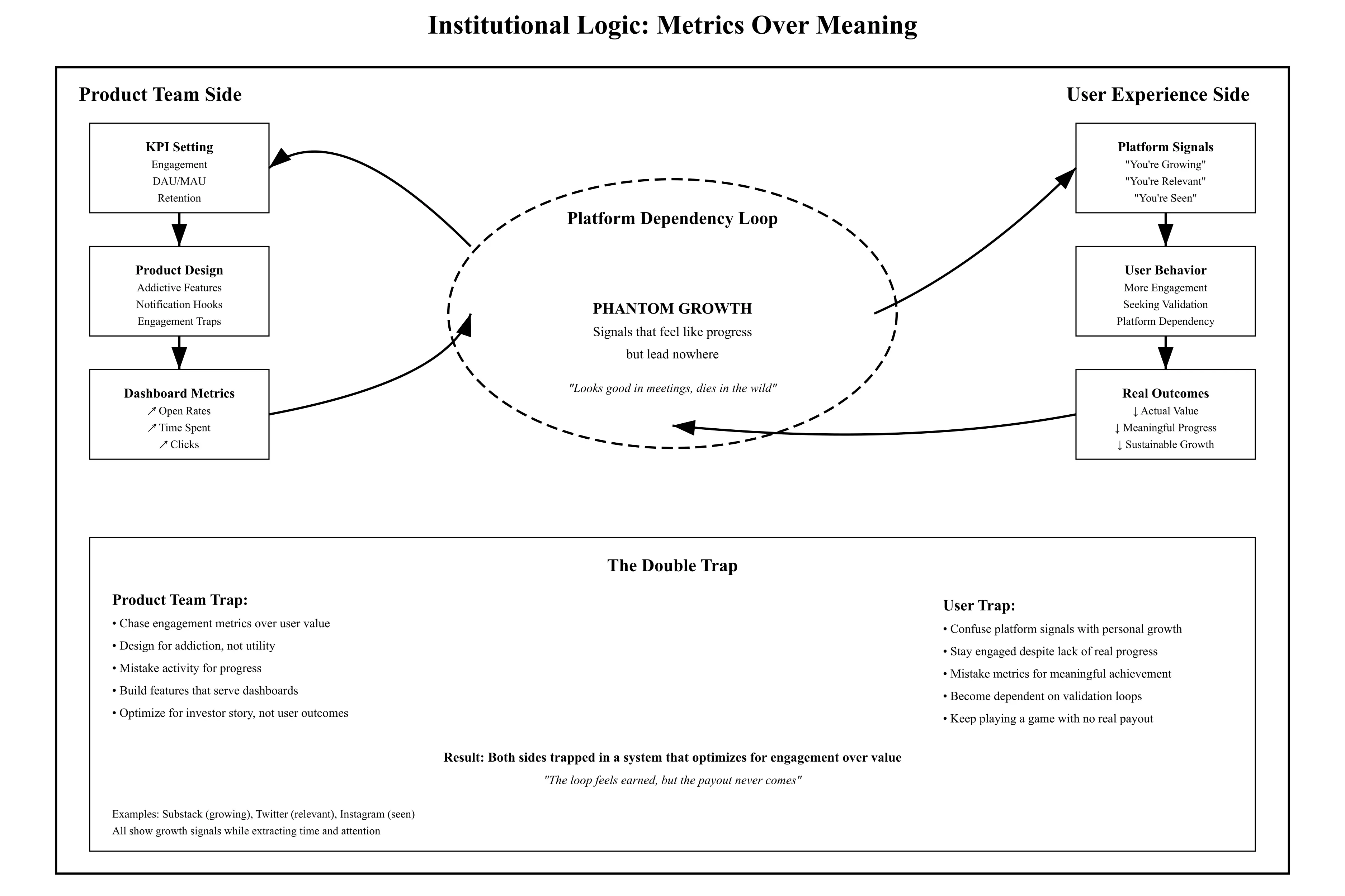
Design teams fall into the same trap. They chase open rates, retention curves, DAU spikes. The dashboards light up. The metrics climb. But few stop to ask: is the engagement meaningful? Is it earned? Is it sustainable?
What they build looks like growth. But it’s not momentum. It’s Phantom Growth - a signal that looks good in a meeting and dies in the wild.
The result is Phantom Growth: data that looks good on slides but leads nowhere.
They all run the same play.
Not growth. Just signals dressed up as progress.
You think you’re getting somewhere. But the payout never comes.
You stay in the loop because the loop feels earned.
User engagement vs Emotional exhaustion
User engagement vs Emotional exhaustion
Art by René Magritte,The Healer (Le Thérapeute), 1937
Broader Consequences: The Cost of False Engagement
Users pay with time.
Creators pay with hope.
When platforms chase vanity engagement, it’s not just clicks they waste. It’s trust.
Over time, users go numb. They start noticing the patterns. The red dots mean less. The notifications blend into noise.
The product stops being a tool and becomes a scoreboard. It gets stuck in Narrative Lock-In - where the only thing left to tell is how many.
And when trust fades, it doesn’t come back.
People don’t just leave the product. They stop believing in it.
Creators burn out - not because their work failed, but because the metrics kept lying, just long enough to make them stay.
Closing Reflection: On Building for Reality
Design is never neutral. Every line of microcopy, every metric chosen, shapes how people make sense of what they’re doing. These choices don’t just guide behavior. They shape belief.
When a product simulates engagement, it builds a loop. The signals feel like progress, but nothing real changes. It becomes routine. Familiar. Hard to notice. Until the meaning is gone.
A system built to keep people moving without ever arriving.
Fixing this does not start with better dashboards or tighter funnels. It starts by asking better questions.
What are we measuring?
What are we rewarding?
What kind of behavior are we teaching?
What kind of future are we building?
Chasing engagement is easy. Designing for meaning is harder. But that is the actual work.
Sisyphus had no choice. We do.
The screen lights up again. Another notification. Another meaningless number.
But this time, instead of pulling you in, it feels like a reminder - that nothing’s really changed.
Anchor Articles and Updates
Feed economy: How Each Platform Manufactures Dependency Loops — Why creators feel burned out, and what platforms don’t want you to understand about their invisible incentive systems
Crisis Is Not the End. It’s a Catalyst for Product Growth. — Reframing the Narrative of Windsurf, Astronomer, and Cluely
Building Products in the AI Era: The Deep Logic of Speed, Content, and Data Ownership — If you’re building a new product in 2025, you’re not competing on functionality.
You’re competing on attention loops, learning velocity, and data leverage.
How AI Platforms Reshape Innovation: Subordination, Risk, and Workflow Strategy — Rethinking Product Strategy Under Model Governance
How AI Understands User Intent Before They Search: Commercial Decision Loops and the Invisible Funnel — Why pre-intent behavior is becoming more legible and monetizable
Inspired by Lenny’s Growth Inflections: AI and Personal Brands Rewiring Startup Growth — AI automation and personal brands are redefining startup growth inspired by Lenny Rachitsky’s Growth Inflections.
Why Growth Marketing Is Not Digital Marketing and Why This Distinction Matters — It’s not that your marketing strategy is flawed. You might just be addressing the wrong problem.
When AI Products Can’t Find PMF, Build a Landing Client Instead — PMF isn’t always found in the product, Sometimes, it starts with one strategic client
Content as a Revenue Tool: Shortening Time-to-Close in Startup Sales — Content that shortens sales cycles, Not just builds traffic
Building Revenue Systems When Scale Isn’t an Option — Profitability First: How Startup Teams Can Drive Revenue in Constrained Markets
Case Studies
Mountain Gentleman — They knew they needed to go digital but had no idea how to start.So we saw things through the rider’s eyes.It wasn’t just about buying gear because it felt like building out your dream GTR.Every part of the journey was designed to match that thrill.
CoinRank — CoinRank needed a fresh way to stand out in crypto. We created a short video strategy that turns complex info into quick, engaging clips that grab attention fast.
最新消息
(GQ® — 02)
©2025
最新消息
(GQ® — 02)
©2025
問答
問答
01
專案內容會包含什麼
02
價格是怎麼計算的
03
所有專案都是固定形式合作嗎
04
在開始合作之後可以調整專案範圍嗎
05
怎麼定義KPI
06
Do you offer ongoing support after project completion?
07
How long does a typical project last?
08
Is there a minimum commitment?
01
專案內容會包含什麼
02
價格是怎麼計算的
03
所有專案都是固定形式合作嗎
04
在開始合作之後可以調整專案範圍嗎
05
怎麼定義KPI
06
Do you offer ongoing support after project completion?
07
How long does a typical project last?
08
Is there a minimum commitment?
The Engagement Illusion: How Design Hooks You on Nothing
How Phantom Metrics, Platform Echoes, and Sisyphean Loops Have Hijacked Our Interfaces
the-engagement-illusion-how-design-hooks-you-on-nothing
Behavioral Design
SaaS Growth and Retention
The Cult of Progress — Designing for the Illusion of Growth
The User in the Loop
You open Substack and check the view count on your latest article. It’s gone up by one or two since yesterday. Sometimes you’re pretty sure those views are just you refreshing the page or accidental clicks.
You start wondering if anyone’s actually reading your stuff, or if these numbers are just there to keep you hanging on.
Then you log into LinkedIn.
A red dot pops up: “You’ve been searched three times.”
You click, hoping for names or real connections.
But there’s nothing. No leads, no interactions - just a prompt: “Upgrade to Premium.”
You swipe through Twitter. It recommends a post you don’t care about.
Facebook’s Memory Nudges
“Three years ago today…” It shows you something sentimental, unasked.
This is nostalgia gamified - recycling the past to spark micro-engagement.
Instagram flashes a new Story from someone you follow out of politeness.
You open an app and immediately see a notification: “Someone viewed your profile.” You click, expecting a name or a sign of real engagement.
The screen is empty. More alerts follow: two people highlighted your post, your content is getting noticed. None have subscribed. Numbers pile up - counters, badges, meaningless signals designed to hold your attention.
You scroll, click, linger. Trapped in a loop that feels like progress but is just noise.
In this loop, you’re no longer a user. You’re the product’s illusionist. Every tap, swipe, and open rewards you not with real value but with simulation. Metrics, not meaning. You think you’re moving forward. But you’re just spinning in place.
You think you're progressing. But you're only spinning.
The Sisyphean Metaphor
Art by Franz von Stuck - Sisyphus (1920)
In Greek mythology, Sisyphus was condemned to roll a huge boulder up a hill - only for it to roll back down every time he neared the top. An endless, pointless task.
If Sisyphus had a smartphone, this is what he’d look like. An endless feed, nonstop numbers, and hope that never quits. He’d keep chasing likes, opens, karma points. But the rock? It never makes it to the top. It just refreshes.
Today’s product design swapped “finishing” for “keep going.” Engagement is basically a treadmill with a shiny interface.
Sisyphus didn’t fail because of the rock. He failed because the whole system made progress impossible.
And honestly, so do we.
This isn’t by chance. It’s a ritual now - like the myth of Sisyphus all over again. Just like him pushing that boulder uphill only to see it roll back down, we push through endless notifications and empty numbers, only to end up right where we started. It feels like effort, but it goes nowhere.
I feel the void. Like, the endless, bottomless void.
User engagement vs Emotional exhaustion
Cognitive Traps Behind the Illusion
Designers build dopamine loops - carefully crafted cycles of small rewards and signals that keep users hooked.
Look at social proof illusions: “You’ve been viewed three times,” but no idea who. Or “You might like this post,” with zero context. These ghost signals stir up FOMO, not real connections.
These aren’t bugs in thinking. They’re baked into the design.
You open Instagram. The Story ring around your profile is glowing, nudging you to check who’s viewed it. You tap in, not for the content, but to scan the viewer list. It always shows the same few names near the top - exes, colleagues, people you haven’t talked to in months. It feels like they’re watching. Maybe they are. Maybe it’s just the algorithm messing with your head.
Take Substack telling you “one visitor today” - even if it’s just you. LinkedIn says you’ve been searched three times but won’t say who. These fake signals trick you into thinking you’re moving forward. The platform wins; you get little in return.
Duolingo tells you you’re on a 12-day streak. You open the app, tap a few words, and close it. It barely counts as learning, but the streak stays alive. And somehow, that feels like progress.
These loops don’t create real progress. They create the illusion of movement. You feel like you’re doing something that matters, but there’s no real outcome. The treadmill runs, but you never get anywhere.
I feel the void. Like, the endless, bottomless void.
Institutional Logic: Metrics Over Meaning
The problem isn’t that users chase the wrong signals. It’s that products are built to make those signals feel like progress.
When engagement metrics become the product’s north star, outcomes for the user stop mattering. The product shifts from being a tool to being a trap.
This isn’t just poor design. It’s a systemic feedback loop. Platforms reward the appearance of movement - clicks, views, opens - not the creation of value.
This is how you end up stuck in what I call the Platform Dependency Loop. Platforms don’t show you real value. They show you something that feels like value, just enough to keep you coming back.
Substack tells writers they’re growing. Twitter tells creators they’re relevant. Instagram tells people they’re seen. The signals feel personal, but they’re optimized to drive one outcome: more engagement, more time spent, more growth - for the platform.
Behind the scenes, the metrics don’t serve the user. They serve the product roadmap (for investor).
Design teams fall into the same trap. They chase open rates, retention curves, DAU spikes. The dashboards light up. The metrics climb. But few stop to ask: is the engagement meaningful? Is it earned? Is it sustainable?
What they build looks like growth. But it’s not momentum. It’s Phantom Growth - a signal that looks good in a meeting and dies in the wild.
The result is Phantom Growth: data that looks good on slides but leads nowhere.
They all run the same play.
Not growth. Just signals dressed up as progress.
You think you’re getting somewhere. But the payout never comes.
You stay in the loop because the loop feels earned.
User engagement vs Emotional exhaustion
Art by René Magritte,The Healer (Le Thérapeute), 1937
Broader Consequences: The Cost of False Engagement
Users pay with time.
Creators pay with hope.
When platforms chase vanity engagement, it’s not just clicks they waste. It’s trust.
Over time, users go numb. They start noticing the patterns. The red dots mean less. The notifications blend into noise.
The product stops being a tool and becomes a scoreboard. It gets stuck in Narrative Lock-In - where the only thing left to tell is how many.
And when trust fades, it doesn’t come back.
People don’t just leave the product. They stop believing in it.
Creators burn out - not because their work failed, but because the metrics kept lying, just long enough to make them stay.
Closing Reflection: On Building for Reality
Design is never neutral. Every line of microcopy, every metric chosen, shapes how people make sense of what they’re doing. These choices don’t just guide behavior. They shape belief.
When a product simulates engagement, it builds a loop. The signals feel like progress, but nothing real changes. It becomes routine. Familiar. Hard to notice. Until the meaning is gone.
A system built to keep people moving without ever arriving.
Fixing this does not start with better dashboards or tighter funnels. It starts by asking better questions.
What are we measuring?
What are we rewarding?
What kind of behavior are we teaching?
What kind of future are we building?
Chasing engagement is easy. Designing for meaning is harder. But that is the actual work.
Sisyphus had no choice. We do.
The screen lights up again. Another notification. Another meaningless number.
But this time, instead of pulling you in, it feels like a reminder - that nothing’s really changed.
Anchor Articles and Updates
Feed economy: How Each Platform Manufactures Dependency Loops — Why creators feel burned out, and what platforms don’t want you to understand about their invisible incentive systems
Crisis Is Not the End. It’s a Catalyst for Product Growth. — Reframing the Narrative of Windsurf, Astronomer, and Cluely
Building Products in the AI Era: The Deep Logic of Speed, Content, and Data Ownership — If you’re building a new product in 2025, you’re not competing on functionality.
You’re competing on attention loops, learning velocity, and data leverage.
How AI Platforms Reshape Innovation: Subordination, Risk, and Workflow Strategy — Rethinking Product Strategy Under Model Governance
How AI Understands User Intent Before They Search: Commercial Decision Loops and the Invisible Funnel — Why pre-intent behavior is becoming more legible and monetizable
Inspired by Lenny’s Growth Inflections: AI and Personal Brands Rewiring Startup Growth — AI automation and personal brands are redefining startup growth inspired by Lenny Rachitsky’s Growth Inflections.
Why Growth Marketing Is Not Digital Marketing and Why This Distinction Matters — It’s not that your marketing strategy is flawed. You might just be addressing the wrong problem.
When AI Products Can’t Find PMF, Build a Landing Client Instead — PMF isn’t always found in the product, Sometimes, it starts with one strategic client
Content as a Revenue Tool: Shortening Time-to-Close in Startup Sales — Content that shortens sales cycles, Not just builds traffic
Building Revenue Systems When Scale Isn’t an Option — Profitability First: How Startup Teams Can Drive Revenue in Constrained Markets
Case Studies
Mountain Gentleman — They knew they needed to go digital but had no idea how to start.So we saw things through the rider’s eyes.It wasn’t just about buying gear because it felt like building out your dream GTR.Every part of the journey was designed to match that thrill.
CoinRank — CoinRank needed a fresh way to stand out in crypto. We created a short video strategy that turns complex info into quick, engaging clips that grab attention fast.
問答
01
專案內容會包含什麼
02
價格是怎麼計算的
03
所有專案都是固定形式合作嗎
04
在開始合作之後可以調整專案範圍嗎
05
怎麼定義KPI
06
Do you offer ongoing support after project completion?
07
How long does a typical project last?
08
Is there a minimum commitment?
The Engagement Illusion: How Design Hooks You on Nothing
How Phantom Metrics, Platform Echoes, and Sisyphean Loops Have Hijacked Our Interfaces
the-engagement-illusion-how-design-hooks-you-on-nothing
Behavioral Design
SaaS Growth and Retention
The Cult of Progress — Designing for the Illusion of Growth
The User in the Loop
You open Substack and check the view count on your latest article. It’s gone up by one or two since yesterday. Sometimes you’re pretty sure those views are just you refreshing the page or accidental clicks.
You start wondering if anyone’s actually reading your stuff, or if these numbers are just there to keep you hanging on.
Then you log into LinkedIn.
A red dot pops up: “You’ve been searched three times.”
You click, hoping for names or real connections.
But there’s nothing. No leads, no interactions - just a prompt: “Upgrade to Premium.”
You swipe through Twitter. It recommends a post you don’t care about.
Facebook’s Memory Nudges
“Three years ago today…” It shows you something sentimental, unasked.
This is nostalgia gamified - recycling the past to spark micro-engagement.
Instagram flashes a new Story from someone you follow out of politeness.
You open an app and immediately see a notification: “Someone viewed your profile.” You click, expecting a name or a sign of real engagement.
The screen is empty. More alerts follow: two people highlighted your post, your content is getting noticed. None have subscribed. Numbers pile up - counters, badges, meaningless signals designed to hold your attention.
You scroll, click, linger. Trapped in a loop that feels like progress but is just noise.
In this loop, you’re no longer a user. You’re the product’s illusionist. Every tap, swipe, and open rewards you not with real value but with simulation. Metrics, not meaning. You think you’re moving forward. But you’re just spinning in place.
You think you're progressing. But you're only spinning.
The Sisyphean Metaphor
Art by Franz von Stuck - Sisyphus (1920)
In Greek mythology, Sisyphus was condemned to roll a huge boulder up a hill - only for it to roll back down every time he neared the top. An endless, pointless task.
If Sisyphus had a smartphone, this is what he’d look like. An endless feed, nonstop numbers, and hope that never quits. He’d keep chasing likes, opens, karma points. But the rock? It never makes it to the top. It just refreshes.
Today’s product design swapped “finishing” for “keep going.” Engagement is basically a treadmill with a shiny interface.
Sisyphus didn’t fail because of the rock. He failed because the whole system made progress impossible.
And honestly, so do we.
This isn’t by chance. It’s a ritual now - like the myth of Sisyphus all over again. Just like him pushing that boulder uphill only to see it roll back down, we push through endless notifications and empty numbers, only to end up right where we started. It feels like effort, but it goes nowhere.
I feel the void. Like, the endless, bottomless void.
User engagement vs Emotional exhaustion
Cognitive Traps Behind the Illusion
Designers build dopamine loops - carefully crafted cycles of small rewards and signals that keep users hooked.
Look at social proof illusions: “You’ve been viewed three times,” but no idea who. Or “You might like this post,” with zero context. These ghost signals stir up FOMO, not real connections.
These aren’t bugs in thinking. They’re baked into the design.
You open Instagram. The Story ring around your profile is glowing, nudging you to check who’s viewed it. You tap in, not for the content, but to scan the viewer list. It always shows the same few names near the top - exes, colleagues, people you haven’t talked to in months. It feels like they’re watching. Maybe they are. Maybe it’s just the algorithm messing with your head.
Take Substack telling you “one visitor today” - even if it’s just you. LinkedIn says you’ve been searched three times but won’t say who. These fake signals trick you into thinking you’re moving forward. The platform wins; you get little in return.
Duolingo tells you you’re on a 12-day streak. You open the app, tap a few words, and close it. It barely counts as learning, but the streak stays alive. And somehow, that feels like progress.
These loops don’t create real progress. They create the illusion of movement. You feel like you’re doing something that matters, but there’s no real outcome. The treadmill runs, but you never get anywhere.
I feel the void. Like, the endless, bottomless void.
Institutional Logic: Metrics Over Meaning
The problem isn’t that users chase the wrong signals. It’s that products are built to make those signals feel like progress.
When engagement metrics become the product’s north star, outcomes for the user stop mattering. The product shifts from being a tool to being a trap.
This isn’t just poor design. It’s a systemic feedback loop. Platforms reward the appearance of movement - clicks, views, opens - not the creation of value.
This is how you end up stuck in what I call the Platform Dependency Loop. Platforms don’t show you real value. They show you something that feels like value, just enough to keep you coming back.
Substack tells writers they’re growing. Twitter tells creators they’re relevant. Instagram tells people they’re seen. The signals feel personal, but they’re optimized to drive one outcome: more engagement, more time spent, more growth - for the platform.
Behind the scenes, the metrics don’t serve the user. They serve the product roadmap (for investor).
Design teams fall into the same trap. They chase open rates, retention curves, DAU spikes. The dashboards light up. The metrics climb. But few stop to ask: is the engagement meaningful? Is it earned? Is it sustainable?
What they build looks like growth. But it’s not momentum. It’s Phantom Growth - a signal that looks good in a meeting and dies in the wild.
The result is Phantom Growth: data that looks good on slides but leads nowhere.
They all run the same play.
Not growth. Just signals dressed up as progress.
You think you’re getting somewhere. But the payout never comes.
You stay in the loop because the loop feels earned.
User engagement vs Emotional exhaustion
Art by René Magritte,The Healer (Le Thérapeute), 1937
Broader Consequences: The Cost of False Engagement
Users pay with time.
Creators pay with hope.
When platforms chase vanity engagement, it’s not just clicks they waste. It’s trust.
Over time, users go numb. They start noticing the patterns. The red dots mean less. The notifications blend into noise.
The product stops being a tool and becomes a scoreboard. It gets stuck in Narrative Lock-In - where the only thing left to tell is how many.
And when trust fades, it doesn’t come back.
People don’t just leave the product. They stop believing in it.
Creators burn out - not because their work failed, but because the metrics kept lying, just long enough to make them stay.
Closing Reflection: On Building for Reality
Design is never neutral. Every line of microcopy, every metric chosen, shapes how people make sense of what they’re doing. These choices don’t just guide behavior. They shape belief.
When a product simulates engagement, it builds a loop. The signals feel like progress, but nothing real changes. It becomes routine. Familiar. Hard to notice. Until the meaning is gone.
A system built to keep people moving without ever arriving.
Fixing this does not start with better dashboards or tighter funnels. It starts by asking better questions.
What are we measuring?
What are we rewarding?
What kind of behavior are we teaching?
What kind of future are we building?
Chasing engagement is easy. Designing for meaning is harder. But that is the actual work.
Sisyphus had no choice. We do.
The screen lights up again. Another notification. Another meaningless number.
But this time, instead of pulling you in, it feels like a reminder - that nothing’s really changed.
Anchor Articles and Updates
Feed economy: How Each Platform Manufactures Dependency Loops — Why creators feel burned out, and what platforms don’t want you to understand about their invisible incentive systems
Crisis Is Not the End. It’s a Catalyst for Product Growth. — Reframing the Narrative of Windsurf, Astronomer, and Cluely
Building Products in the AI Era: The Deep Logic of Speed, Content, and Data Ownership — If you’re building a new product in 2025, you’re not competing on functionality.
You’re competing on attention loops, learning velocity, and data leverage.
How AI Platforms Reshape Innovation: Subordination, Risk, and Workflow Strategy — Rethinking Product Strategy Under Model Governance
How AI Understands User Intent Before They Search: Commercial Decision Loops and the Invisible Funnel — Why pre-intent behavior is becoming more legible and monetizable
Inspired by Lenny’s Growth Inflections: AI and Personal Brands Rewiring Startup Growth — AI automation and personal brands are redefining startup growth inspired by Lenny Rachitsky’s Growth Inflections.
Why Growth Marketing Is Not Digital Marketing and Why This Distinction Matters — It’s not that your marketing strategy is flawed. You might just be addressing the wrong problem.
When AI Products Can’t Find PMF, Build a Landing Client Instead — PMF isn’t always found in the product, Sometimes, it starts with one strategic client
Content as a Revenue Tool: Shortening Time-to-Close in Startup Sales — Content that shortens sales cycles, Not just builds traffic
Building Revenue Systems When Scale Isn’t an Option — Profitability First: How Startup Teams Can Drive Revenue in Constrained Markets
Case Studies
Mountain Gentleman — They knew they needed to go digital but had no idea how to start.So we saw things through the rider’s eyes.It wasn’t just about buying gear because it felt like building out your dream GTR.Every part of the journey was designed to match that thrill.
CoinRank — CoinRank needed a fresh way to stand out in crypto. We created a short video strategy that turns complex info into quick, engaging clips that grab attention fast.
問答
專案內容會包含什麼
價格是怎麼計算的
所有專案都是固定形式合作嗎
在開始合作之後可以調整專案範圍嗎
怎麼定義KPI
Do you offer ongoing support after project completion?
How long does a typical project last?
Is there a minimum commitment?